Impact Arts Brand Development
Industry: Arts & Non-Profits, EducationEstablishing brand architecture and language with newly launched Impact Arts.
Offerings: Brand Strategy, Creative Direction, Design Direction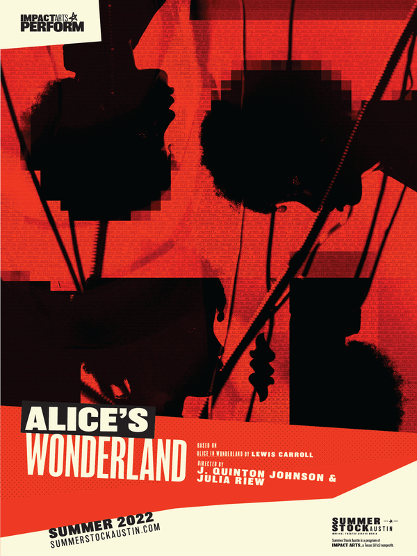


What brand story do we want to tell, and how do we represent it in an appealing and compelling way?
We worked with Impact Arts Founder Ginger Morris and her team to identify the necessary foundations of the brand architecture.
I’ve worked with John and The Collective for two decades and am proud of our relationship. From the Texas Arts Project to Summer Stock Austin to ImpactArts, we’ve created educational brands that have transformed the lives of young performers across central Texas. I appreciate that The Collective always starts from research and leads to unique experiences. I’m constantly surprised by their out of the box points-of-view and insight-driven approaches – that always lead to powerful outcomes. And everything looks amazing!
Through open discussion about what best represents the brand and visual experimentation, we explored two brand directions using mood boards and concept language – one more bold and one more conservative.
The ResultProvided the team with two concepts and chose a direction.
Compiled a collection of logo sketches and sub-brand development to choose from.
Provided creative direction on brand typography and rules to follow/understand.
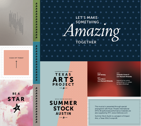
The OutcomeThe team chose a brand architecture that represented their message and appealed to their target audience, including: main logo design, sub-brand logos and colors, typography, colors, and visual vocabulary.
The Process
We started with a whiteboarding exercise. After a creative and collaborative ideation session with the Impact team, we went through a process of word-mapping and visual ideation to build these visual language boards
Concept 1: Clarity
Play with contrast
Light-to-dark
Small patterns
Natural lines
Natural colors
Gradients
Layers
Subtle texture
I want to help you find the way. I’m wordly, confident, and content. I’m see all and know all. I’m a mentor, a guide, a teacher. I speak softly and about grand things. Sometimes chaotic and sometimes methodical, I’ll always provide a complete picture.

Concept 2: Down Center Spot
I’m awake. I’m alive. I’m shining with brightness. I’m the impact in your daily coffee. I’m here to make change and be bold. If you need something done, come to me. We are going to make a difference. Promise.


Logo Sketching

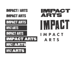
The Final Primary Logo

Sub-Brand Development


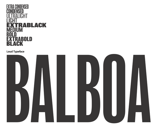
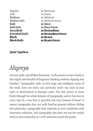
Typographic Rules for Impact
The brand typography is, in it’s loudest moments high-contrast and playfully aggressive. There must also be a delicate balance built with smaller, quieter moments where appropriate. Those quiet moments are concise, clear, thoughtful, and mature. The lead you gently through communication.
Basic typography rules to follow/understand
Plenty of clear space. Do not abhor a vacuum.
Follow proper grammar and punctuation.
Everything has an underlying grid. (See grids.)
Everything is legible.
Hierarchy is key.
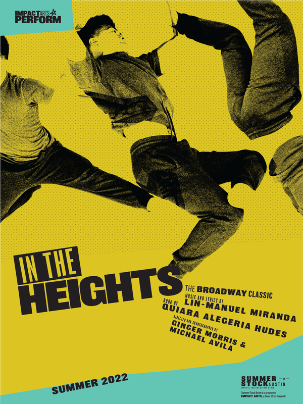
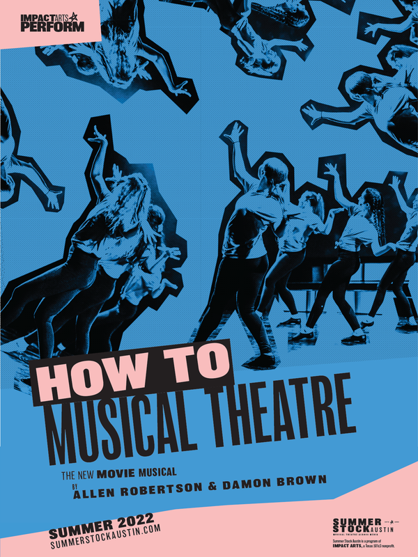
Pre-Release Brand Materials for Summer Stock Austin